
Exploring the Art of Colour Harmony in Visual Design
In the realm of visual design, colour holds a power that transcends the mere arrangement of hues on a canvas. It can evoke emotions, communicate messages, and create a lasting impact on the viewer. The skilful use of colour harmony lies at the heart of every captivating design, whether it's a website, a logo, a painting, or even an advertisement. In this blog post, we're delving into the captivating world of colour theory and harmony, uncovering the secrets that make designs truly stand out.
The Language of Colours:
Colours are more than just visually pleasing; they speak a language of their own. Each colour carries distinct meanings and emotions, which designers can strategically tap into to communicate a specific message.
For example, warm colours like red and yellow evoke energy and passion, while cool colours like blue and green convey tranquillity and trust. Understanding this language helps designers craft visuals that resonate deeply with their intended audience.
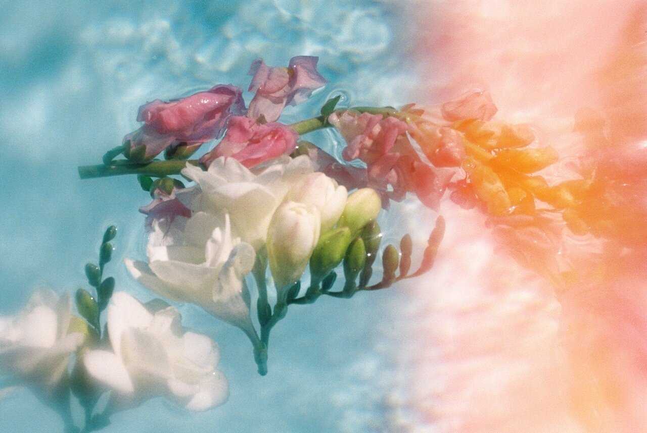
Creating Harmonious Colour Palettes:
Harmony in design refers to the pleasing arrangement of colours that work well together. Achieving colour harmony involves selecting a palette that enhances the overall aesthetic and reinforces the intended mood. There are several popular colour schemes to choose from, such as complementary, analogous, triadic, and monochromatic. Exploring each scheme's characteristics and application can provide designers with a toolbox of options to create captivating visuals.
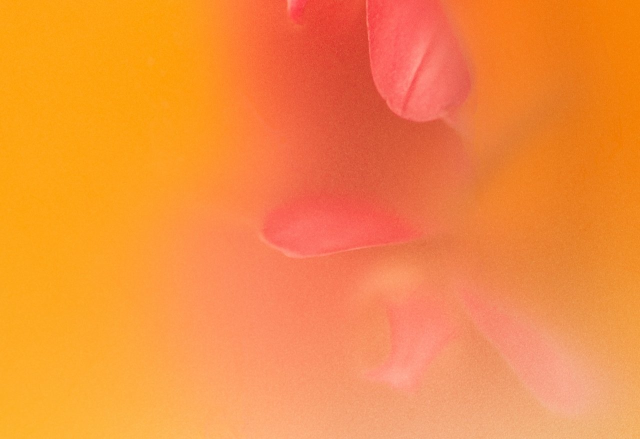
The Psychology of Colour:
Colour psychology explores the psychological effects that different colours have on human behaviour and perception. Red might incite urgency or excitement, blue could induce a sense of calm, and green might evoke feelings of growth and renewal. By tapping into these psychological triggers, designers can guide viewers' reactions and actions, making colour a powerful tool in marketing, branding, and communication.
Real-World Examples:
To illustrate the concepts discussed, let's look at a few real-world examples. Consider iconic brands like Coca-Cola and Pepsi. Both use red in their branding, but with distinct intentions. Coca-Cola's use of red evokes warmth and tradition, while Pepsi's blue embodies a sense of trust and modernity. Analysing such cases helps us understand how colour choices are driven by branding goals and audience perception.

Practical Tips for Colour Harmony:
Start with Mood: Define the mood you want your design to convey, then select colours that align with that mood.
Use Colour Wheel Tools: Online colour wheel tools can help you identify complementary or analogous colour combinations effortlessly.
Limit Your Palette: Don't overwhelm your design with too many colours. Stick to a few main colours and use shades, tints, and tones to create variety.
Consider Accessibility: Ensure your colour choices are accessible to all users, including those with visual impairments.
The art of colour harmony in visual design is a blend of science, psychology, and creativity. The colours you choose and how you arrange them can determine the success of your design in communicating its intended message. By delving into colour theory, understanding the psychology behind colours, and applying practical tips, you can elevate your designs to new heights of visual impact.
Remember, colour isn't just a visual element; it's a storytelling tool that can captivate and connect with audiences on a profound level. If you’d like some help with your branding colours, feel free to reach out to our team!